


About the Project
Homee Inc. provides a digital platform designed to streamline and transform the property insurance claims process. This process is supported by tools like the HOMEE Pro Portal, which allows real-time claims management and enhances communication between all parties involved.
My Role
Lead UX Designer
Project Name: Pro Portal, Customer Portal, Workshop, Gateway
Type: Desktop, Mobile App
Software: Figma, Figjam, Jira, Confluence
Date: February 2022 - June 2024

Lifecycle of a Claim

1. Damage Reported
The homeowner files a claim with their personal insurance by filling out an intake form.

2. Claim Created
Homee manages the claim and matches the best Pro to handle the repair.

3. Submit Estimate
Once accepted, the pro will schedule a time with the homeowner for an inspection.

4. Repairs
After the budget is approved for the materials and labor, the pro schedules the repair.
Define our UX Process
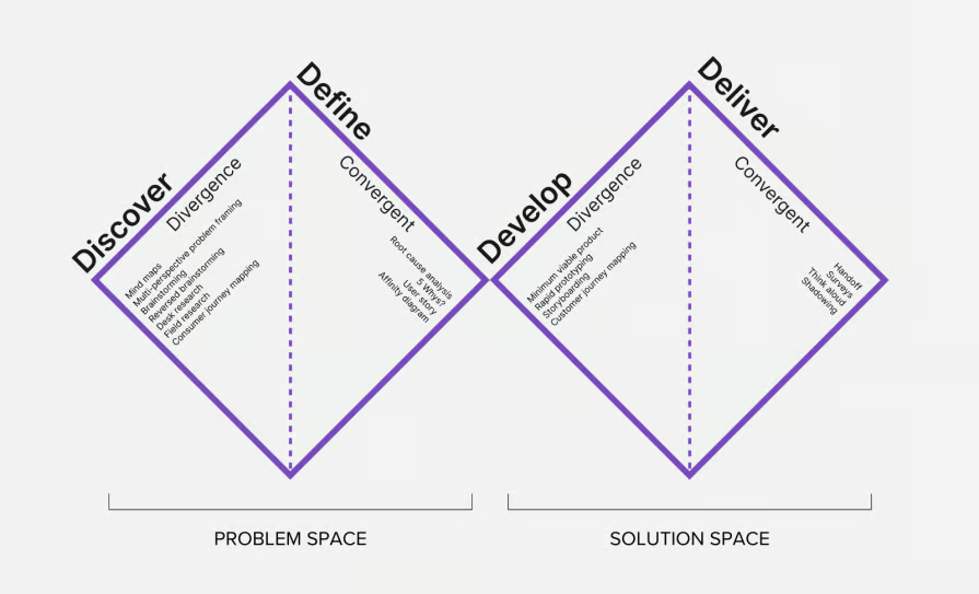
User Journey Flow Chart

Low Fidelity Wireframes

Research


Design System


Brand Identity


A/B TESTING:
Optimizing Assignment Management:

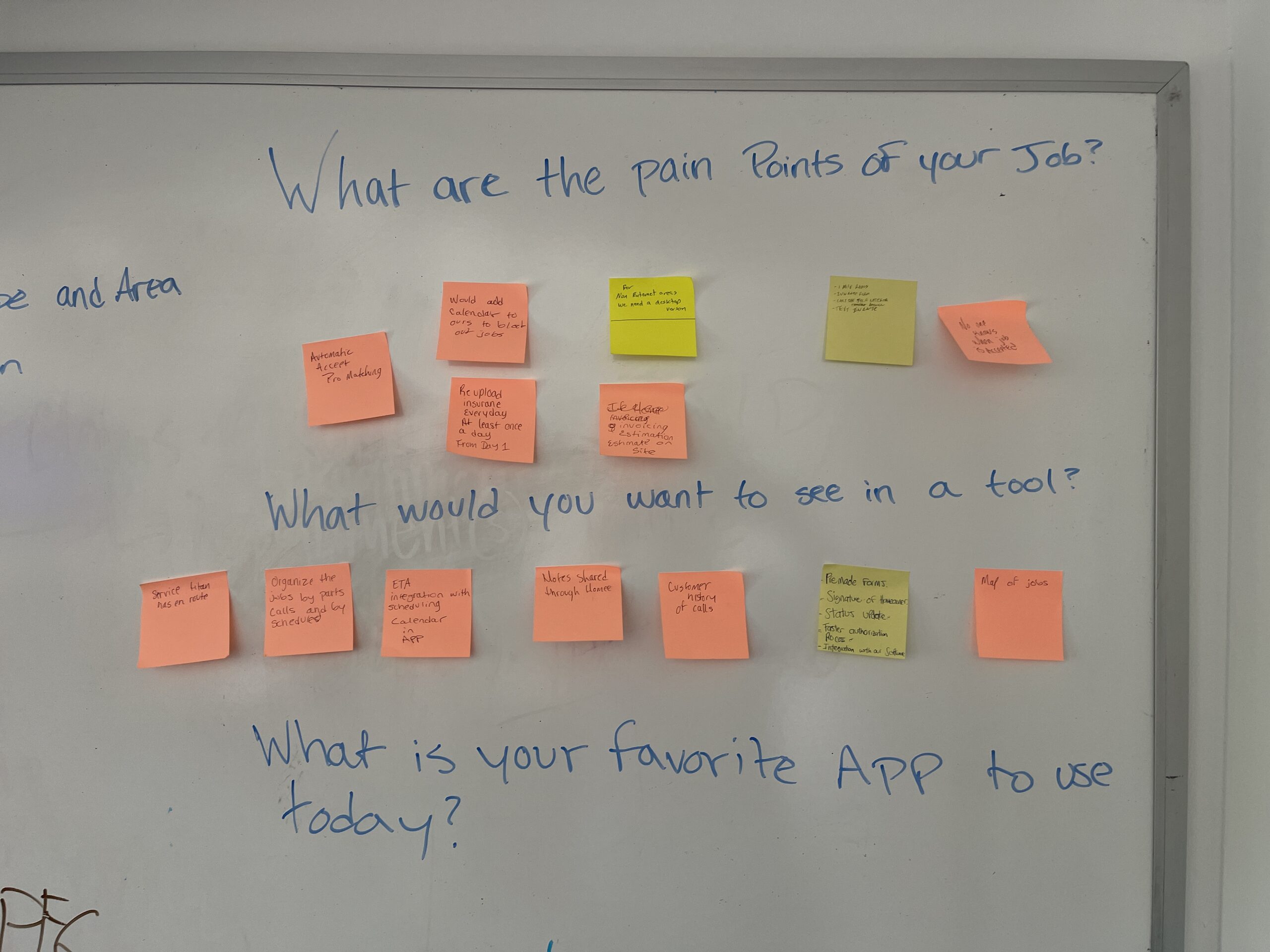
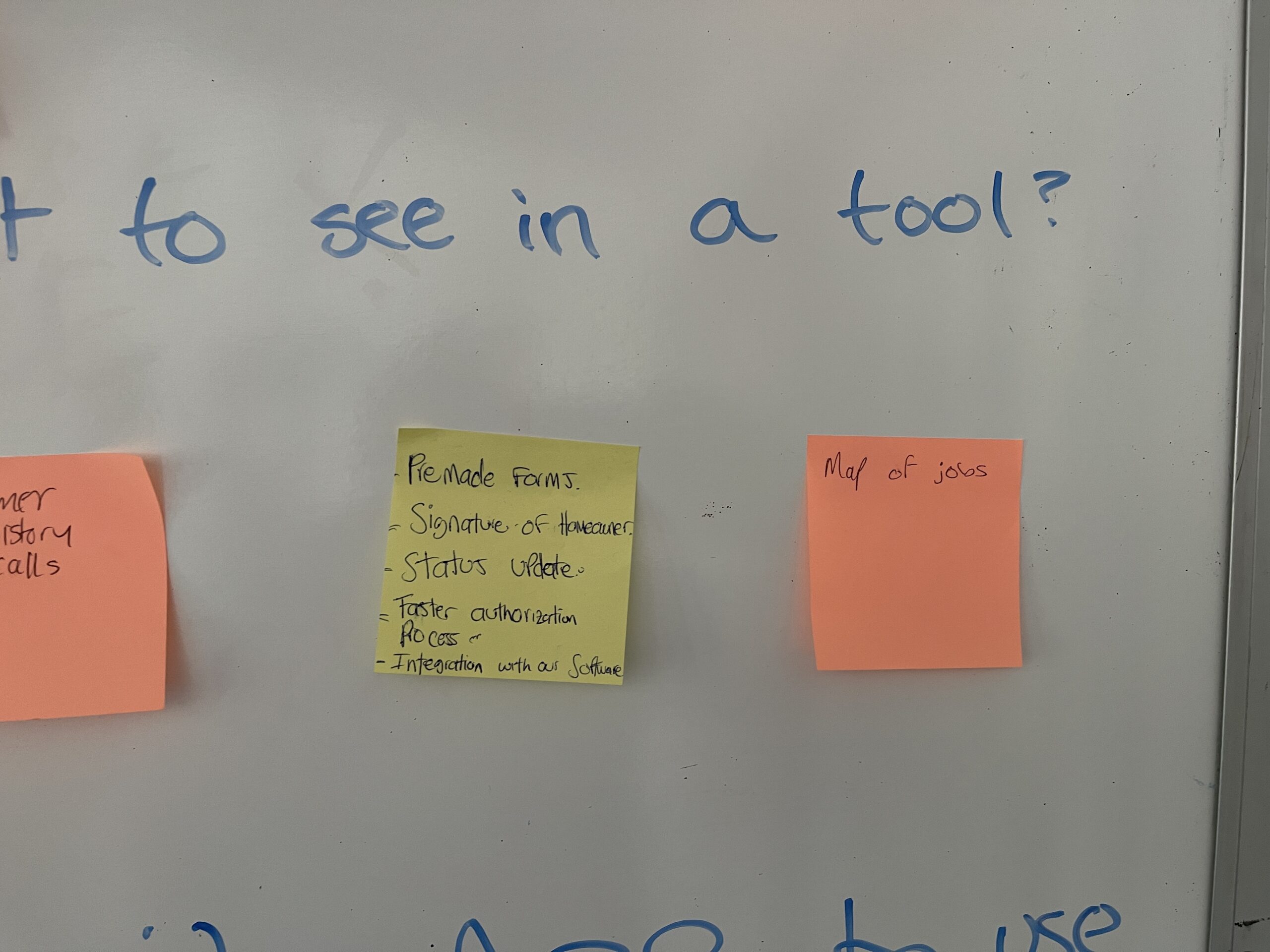
Opportunities for Improvements
Table-Driven Navigation vs. In-Context Drawer Workflow
I A/B tested two assignment-management prototypes to evaluate efficiency, scannability, and task flow—specifically how pros and admins review assignments, apply filters, and access detailed project information.
Design A – Full Page, Table-First Experience


Assignments Dashboard
- Design A focused on a simplified, highly efficient assignments table that allowed users to scan and manage work at scale.
- Assignments were displayed in a fully responsive, customizable table showing key data such as dates, insurance providers, workflow type, status milestones, homeowner and technician names, and addresses.
- Users could drag and drop columns, hide or show categories, and save their preferred layout.

- Filtering was designed to be flexible and powerful, with filters displayed as tags.
- Custom filters allowed users to combine two or three criteria into a single named tag for quick reuse.
- Selecting an assignment navigated users to a dedicated details page with tabbed sections for assignment details, notes and documents, photos, repair details, full project logs, and estimates, along with a side-panel drawer for admin or manager notes.

Assignment Details
Upon selecting an assignment, users are directed to a detailed overview page that includes a clearly organized To-Do List outlining the next steps. This page also features key sections such as:
-
Loss Details: Provides a comprehensive summary of reported home damages, including annotated photos of areas requiring repair.
-
Technician Notes: Offers insights and observations from the assigned technician.
-
Materials & Costs: Lists required materials along with associated costs.
-
Documentation: Centralized access to all related files and supporting documents.
Design B – In-Context Drawer with Status Overview
Assignments Details Drawer
- Design B kept the same table structure and data but shifted the interaction model.
- Clicking an assignment opened a half-screen drawer instead of navigating away, allowing users to view and act on details while maintaining context within the assignments list.
- The drawer could be minimized and persisted as a tab at the bottom of the screen, providing a quick preview and easy return to active work.

Assignments Table Design B
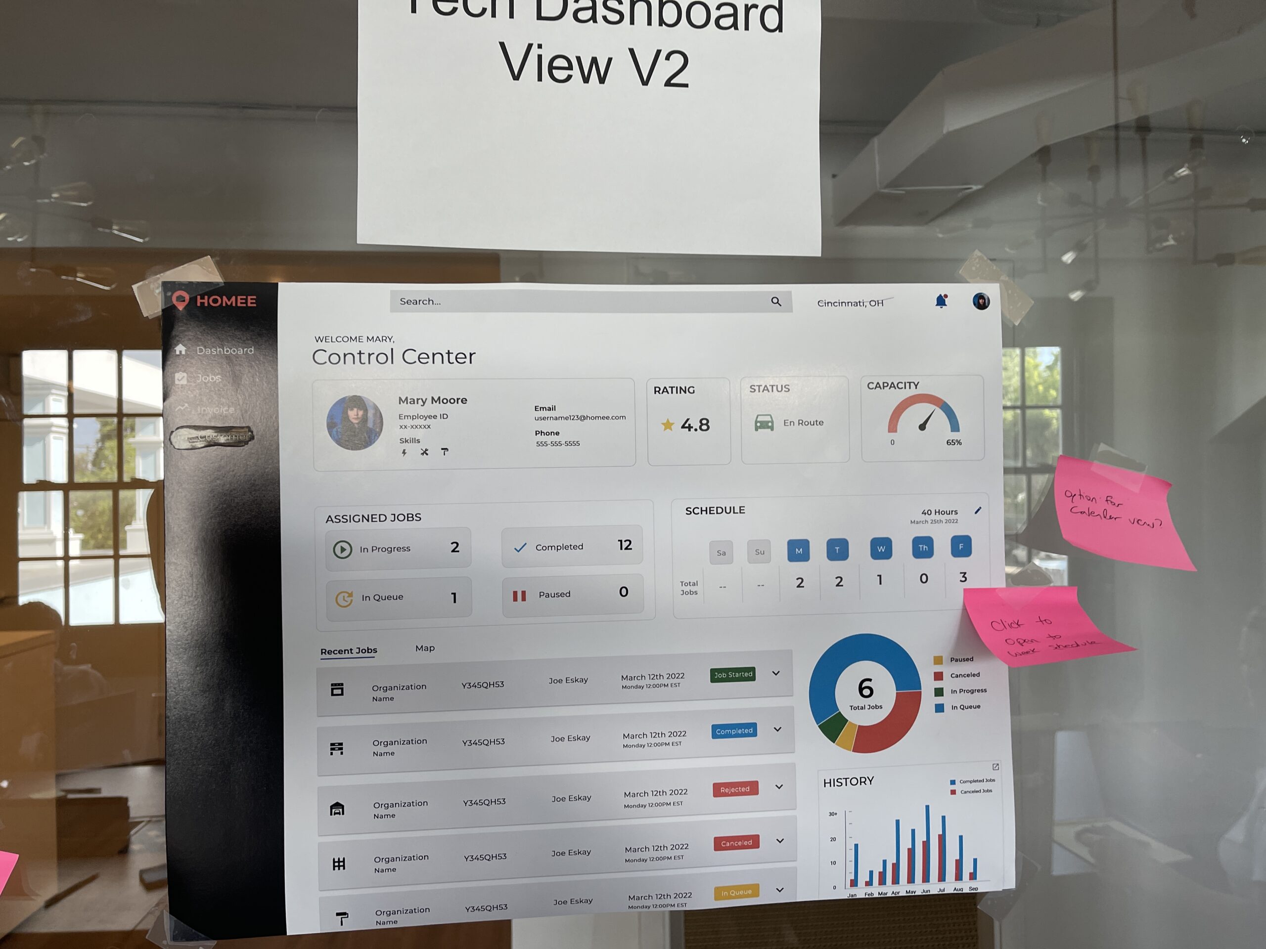
This version introduced high-level summary cards at the top of the page, giving users an at-a-glance view of assignments that were unscheduled, in progress, pending, or on hold—supporting faster prioritization and status awareness.

The dashboard enables companies to efficiently manage and sort through all assignments. Key details are prominently displayed, including assignment status, assigned technician, claim ID, and important dates such as when the assignment was opened, scheduled, and closed.
Pro Portal Mobile


Conclusion
