Worldpay from FIS – Shopper Insights
August 29, 2020
Verizon Conditioned Based Maintenance
June 28, 2021Fleet Monitoring System
First Student is the leading school transportation solutions provider in North America and as such they transport more passengers per day than all of the U.S. airlines combined..

About the Project
First Student is the leading school transportation solutions provider in North America and as such they transport more passengers per day than all of the U.S. airlines combined.
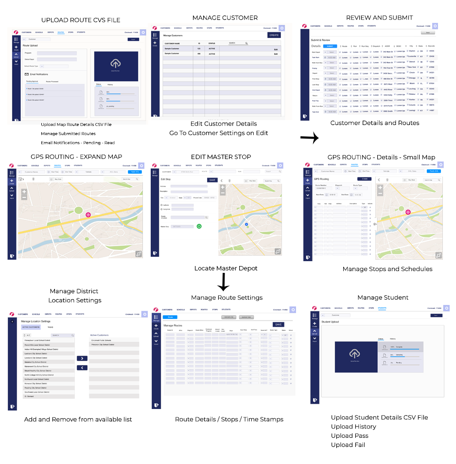
Monitoring all of those buses and passengers is extremely important, which is why the RDM application was introduced. The key functions needed were to help dispatch easily set up and see the drivers routes, monitor their stops and see how fast and how safe passengers (the students) are reaching their destinations. It is also used as a tool to gather data to find better ways for the drivers to reach their goals more efficiently in the future.
I was to provide a brand new look and flow from their old dispatch system (FOCUS). It needed to be more professional in style, intuitive to navigate and easy to learn.

My Role
Lead UX Designer
Project Name: RDM Fleet Management
Type: Desktop
Software: Figma, Figjam,
Date: May 2019

My Responsibilities
- Visual Design
- Responsive design
- Frontend development
- Sitemap
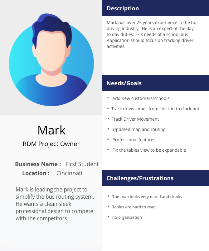
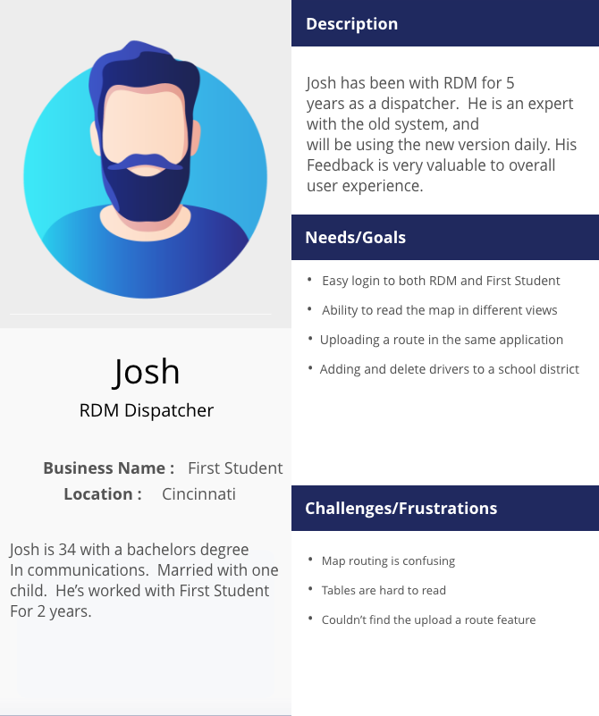
- Personas
- Wireframes
- User Experience
Research
1. Understanding the current application
For about 2 weeks I sat with the client and was trained on how to use their current system. I learned the primary goals for the dispatcher to get a better understanding of where we needed improvements.
2. Define users’ motivations, needs, and frustrations when using the FOCUS application.
The end users use this tool 9 to 5, five days a week, and is critical in managing their customers so eliminating frustrating issues that made the old tool clunky and completely outdated was a high priority. I went over preliminary sketches to gain feedback. I asked questions on what is improved, taking a step back, and what we need to add.
3. Discuss different scenarios for customers and dispatchers.
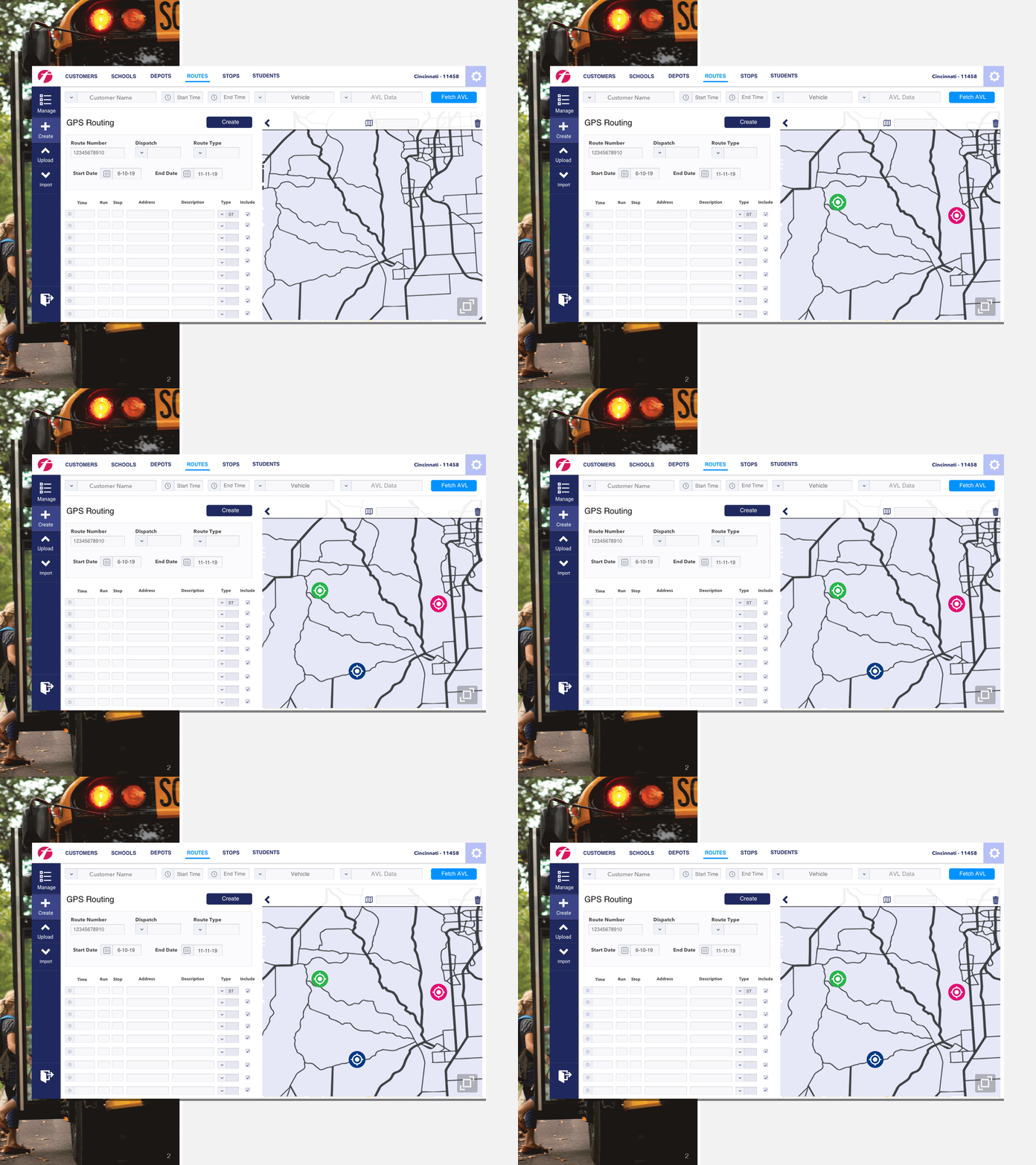
Driver routes needed to be tracked for better efficiency, but the old system was impossible to see the times with the stops on the map. We went over different routes and compared them.
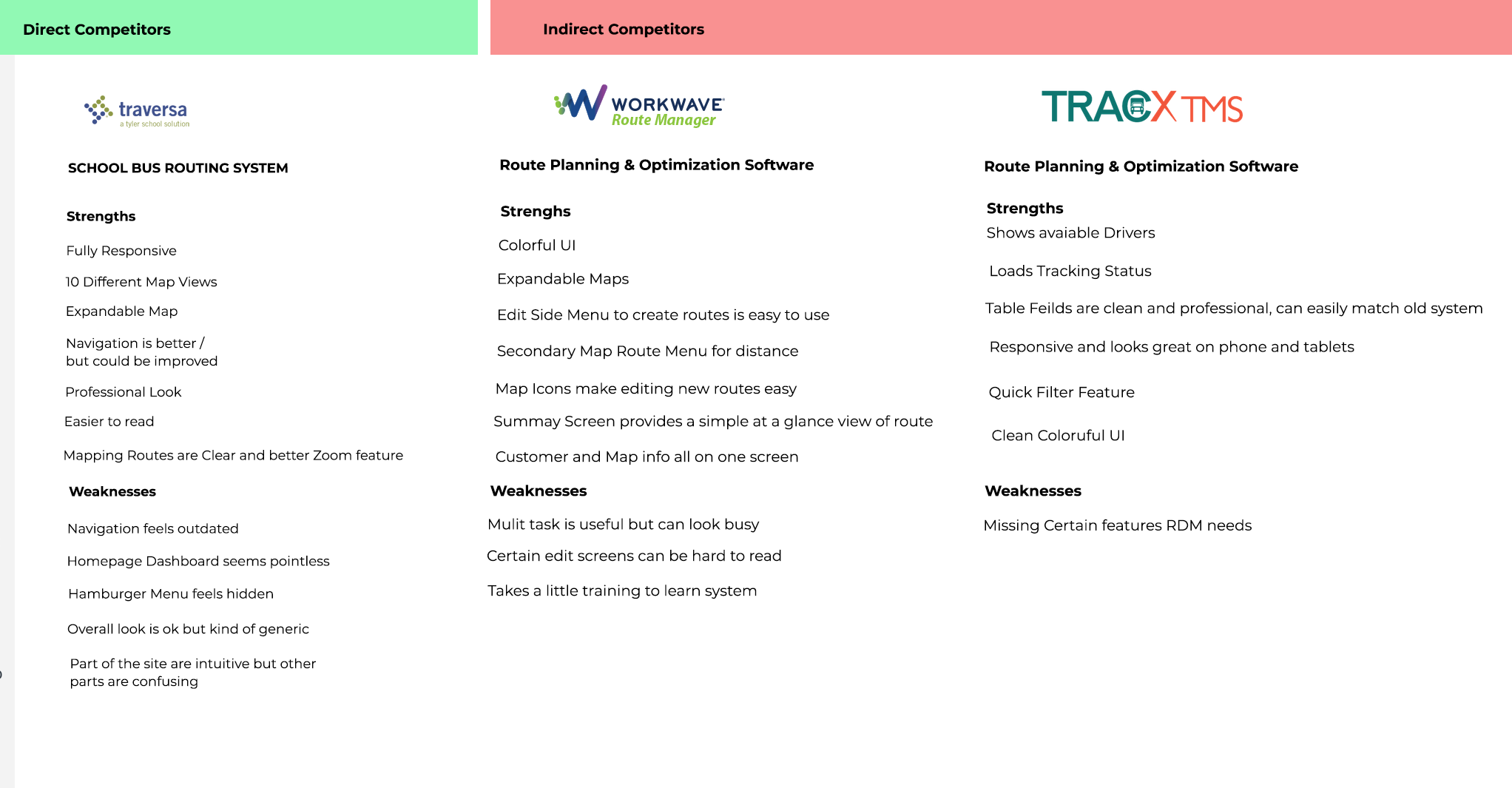
4. Listed the competitor's strengths and weaknesses.
I carefully went over the competitor's applications and listed what works and what doesn't and what matched the client's needs.
5. Working in an agile environment.
I sat with the engineers and the project manager daily to review using excel, whiteboard, and sticky notes to list priorities and draw up quick wireframes to illustrate ideas for the flow.

Usability Testing & Feedback
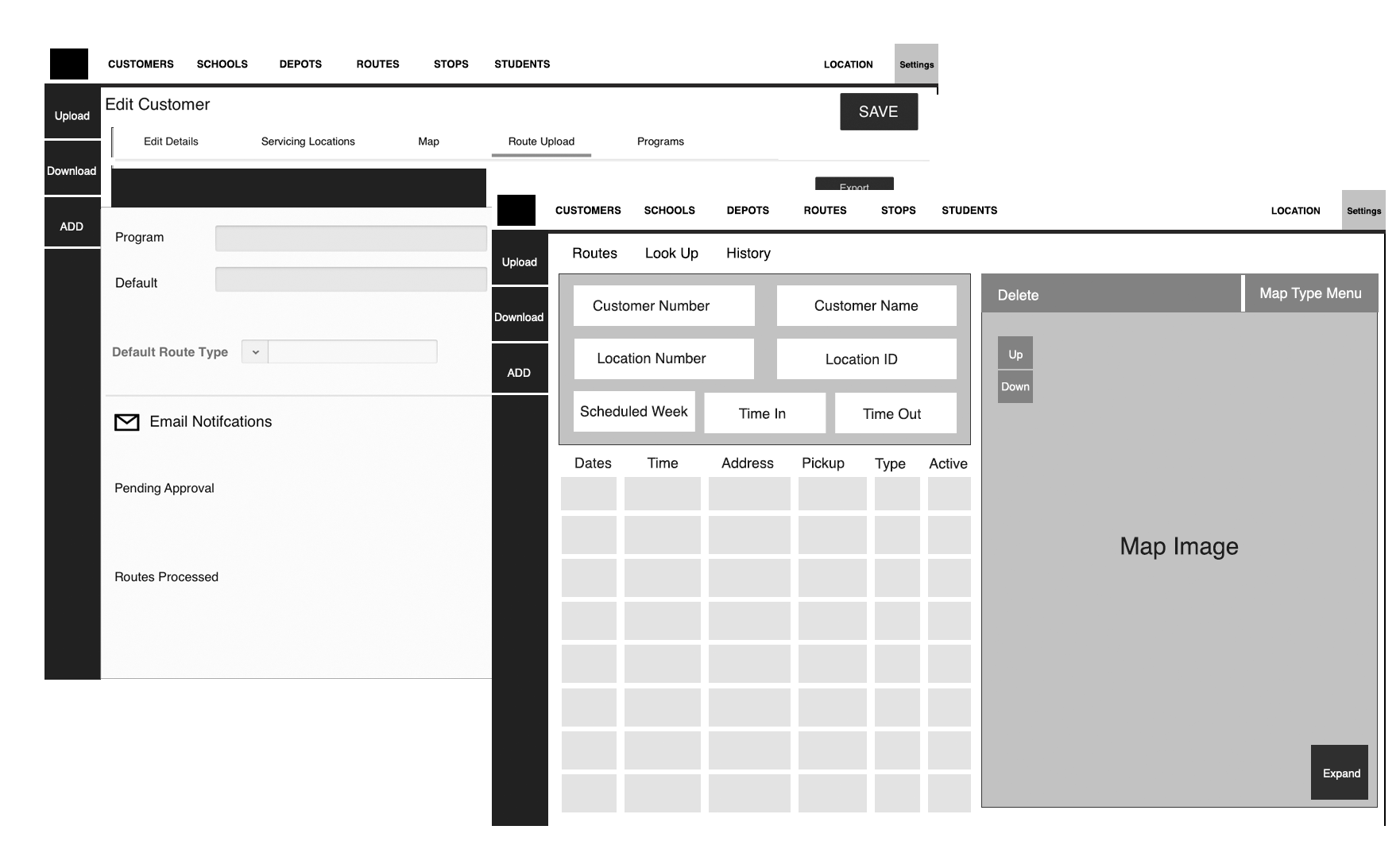
Initial presentation of the wireframes.
I sat with the project owner and other members of the FOCUS team to get feedback and the simple wireframes to show layout and feel. The biggest negative feedback I had was the map view. It wasn't as robust as the old application and some competitors.
First Round of User testing
Showing a prototype over a prototype, this was the first look at a more detailed design and closer to the finished project. The biggest complaint was the lack of understanding of how a customer is added. I reworked this approach and drew up a new wireframe to find a solution that made sense.
Second Round of User testing
On the second round, we recorded service techs and dispatchers giving real-time feedback. This feedback was the most valuable as we were able to see how we had radically improved the experience from the first round with usability and flow.
Wireframes
Both wireframes and prototypes were all built and shared using Sketch.
